THE CLIENT:
PANTER’S GARAGE
THE CHALLENGE:
Our friends at Panter's, a well-established business in the community for 68 years, approached us for a rebrand. Their goal was to honor their long-standing heritage while modernizing their brand and improving their online presence. They wanted to communicate to their audience that, in addition to their trusted quality services, they now offer a variety of new options focused on sustainability and service to their community.
THE SOLUTION:
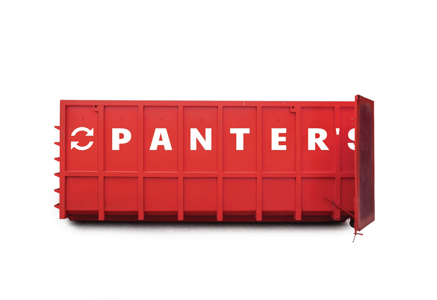
To address Panter's rebranding needs, we crafted a modernized brand identity that balances relevance with tradition. By incorporating bold sans serif fonts and a vintage-inspired color palette, we achieved a look that feels fresh yet respectful of their 68-year history. Additionally, we integrated subtle elements of recycling symbols into the logo, emphasizing their commitment to sustainability.
We revamped their website - transforming it from a basic, minimal design into a robust, SEO-friendly masterpiece. The new site not only improves online performance but also serves as a comprehensive resource for customers. It features detailed information about Panter’s services, customer reviews, industry updates, current pricing, FAQs, and more - creating a dynamic online presence that truly represents the brand's evolution and commitment to the community.
Services we Provided:
Custom branding
Custom Squarespace Website design
See it in action: Website

VINTAGE BRANDING
WITH A MODERN APPROACH
The Panter's logo skillfully combines vintage branding elements with a forward-thinking approach to sustainability. The use of bold, sans-serif typography reflects a modern, clean aesthetic, while the choice of timeless colors gives a nod to traditional branding. This balance helps maintain the brand's established roots, appealing to long-time customers and those who value a sense of heritage.
The incorporation of circular arrows around the name “Panter's” subtly implies recycling and sustainability. This choice aligns with modern values and signals a commitment to environmentally-friendly practices. By blending these vintage and contemporary elements, the logo successfully positions Panter's as a brand that respects its history while embracing a sustainable future, making it both relatable and progressive.
BRANDING PACKAGE
Primary and Secondary Logos, Logo variations, Icon, Favicon, and Curated Color Palette
“This new branding and website really, really help put us on the map as a semi-start-up.”
—Robert at Panter’s
Set Up for Success
This initial branding package investment streamlines all future marketing efforts by providing consistent visual and messaging guidelines, making it easier to create everything from advertisements to social media content.
With a solid brand foundation in place, Panter’s will save time and resources down the road, ensuring every customer touchpoint reinforces the brand’s identity, message, and values. This consistency not only will make their lives easier but also significantly contribute to their growth and success.
THE NEW WEBSITE
On-Brand & Updated
The Panter's Garage website redesign features an updated, on-brand design that reflects the company’s revitalized identity.
Intuitive & User-Friendly
The site now offers intuitive navigation and a clean layout, making it easy for visitors to find information about services, customer reviews, and industry.
Desktop & Mobile Friendly
Designed to be both desktop and mobile-friendly, the site ensures a seamless user experience across all devices.
SEO Optimized
The website is optimized for SEO to enhance visibility on search engines - helping more customers find them online.
Money Maker
The inclusion of customer reviews and business statistics adds credibility and builds trust with new and existing customers.A simple, easy-to-use contact form is included to facilitate customer inquiries.
HOMEPAGE BEFORE & AFTER
The new Panter's website is designed to drive more business and increase revenue. By providing a more professional and visually appealing design, the site enhances the company's brand image, making it more attractive to potential customers.
The easy-to-navigate structure allows visitors to quickly find the information they need, reducing frustration and encouraging them to take action, such as booking a service or making an inquiry.

“Emily and Lance were great to work with. They always kept their word on the time that things would be finished. Our project was in an industry brand new to them and they still knocked it out of the park. Highly recommend.”
—Panter’s Owner
A Revitalized Brand and Website that Reflect Panter’s Identity and Boost Growth
What was waiting for Panter’s on the other side of this project?
A refreshed identity that reflects their updated ownership and expanded service offerings.
A new brand that blends tradition with modern relevance, creating an identity they are proud to share with customers and the community.
An updated, SEO-friendly website that enhances their online presence, helping to drive traffic and engage effectively with their audience.
A website that serves as a comprehensive platform for customers to learn about Panter's full range of services and access industry updates, current pricing, FAQs, and more.
A complete branding package that equips them to advertise consistently and strengthen their connection with the community.
An ideal setup for continued business growth and success.
Are you ready to grow your business through an updated brand and website that drives your customers to take action?
We can help with that. Book a discovery call today!


